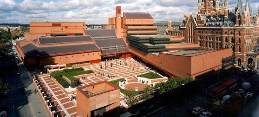
An Observation on Architecture
I read that the architect of the British Library deliberately designed it to be understated in order to avoid overshadowing St Pancras Station next door. As modern buildings go the British Library is not bad and the interior is very fine and well designed. However, I believe that deliberately designing a building so that it does not overshadow the one next to it is a fundamentally flawed idea.
To illustrate this point take Liverpool's waterfront - the "Three Graces":
The building that came first was the Port of Liverpool building - the domed building on the right - then came the Cunard building in the middle, and finally the Liver building on the left.
Imagine if the architect of the Liver building had thought, "I'm going to make my building deliberately understated so as not to overshadow the Port of Liverpool and Cunard buildings".
Rather than overshadowing the Port of Liverpool building, the fact that the Liver building is so fine and grand makes the other two buildings more prominent, not less, and achieves a very fine set piece that has become known as the Three Graces.
If the architect of the British library had made it as grand as St Pancras station then the two buildings side by side would have achieved a level of prominence and beauty far greater than the sum of each individual building. A British Library that was as prominent as St Pancras Station would have complimented St Pancras, made it more impressive and would not have taken away from it or overshadowed it at all.

